
Home / UX processes / Site review process
Site review process
A client needed a review of their site where they present their product, an event management tool/platform. The goal was to find key points where the site could be improved and suggest those to the client. The design studio had previously created and worked on the App, branding, content, and product for the same client.
Goals and target groups
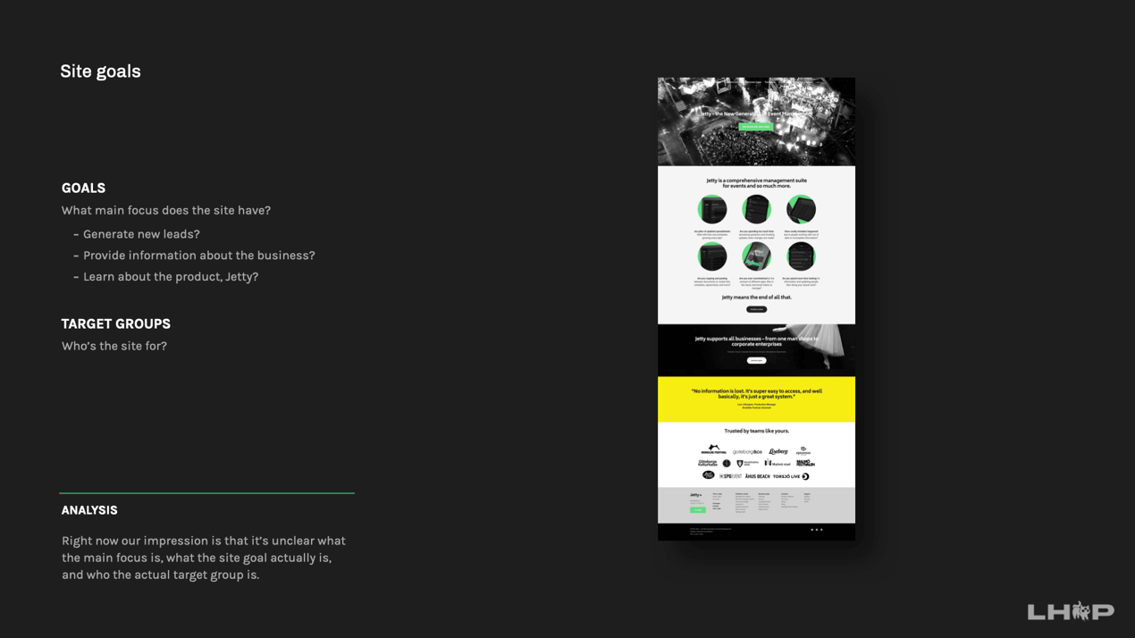
What main focus/goals does the site have?
- To generate new leads?
- Provide information about the business?
- To learn about the product
Who is the site for, what are the target groups?

Tips
- Lead the user to reach the goal
- Provide right information at the right time
- “Less is more”. A classic saying, but often so true.
- Readability (contrasts, text on images etc.)
- Balance with colors
- Balance with information & images
- Call To Actions (CTA:s)
- Be consistent and clear with links, buttons, texts, etc. –Form formats & ideas
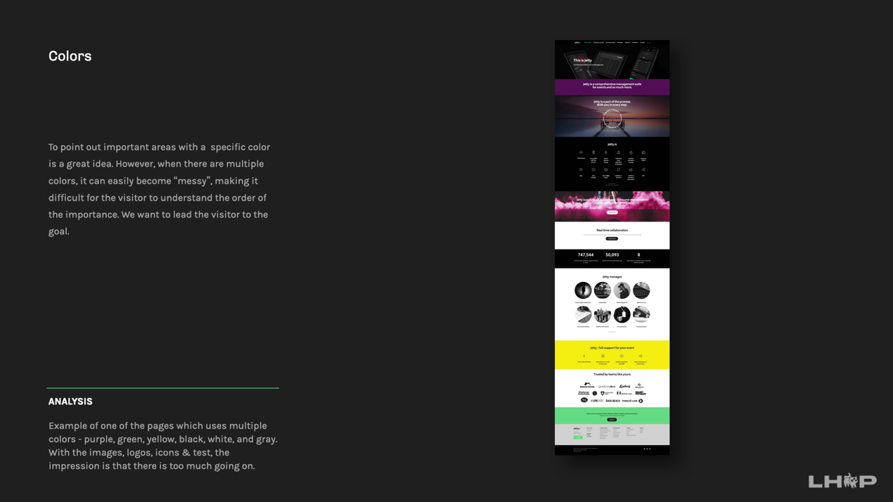
Colors
To point out that highlighting important areas with a specific color is a great idea. However, when there are multiple colors, it can easily become “messy”, making it difficult for the visitor to understand the order of the importance. We want to lead the visitor to the goal.
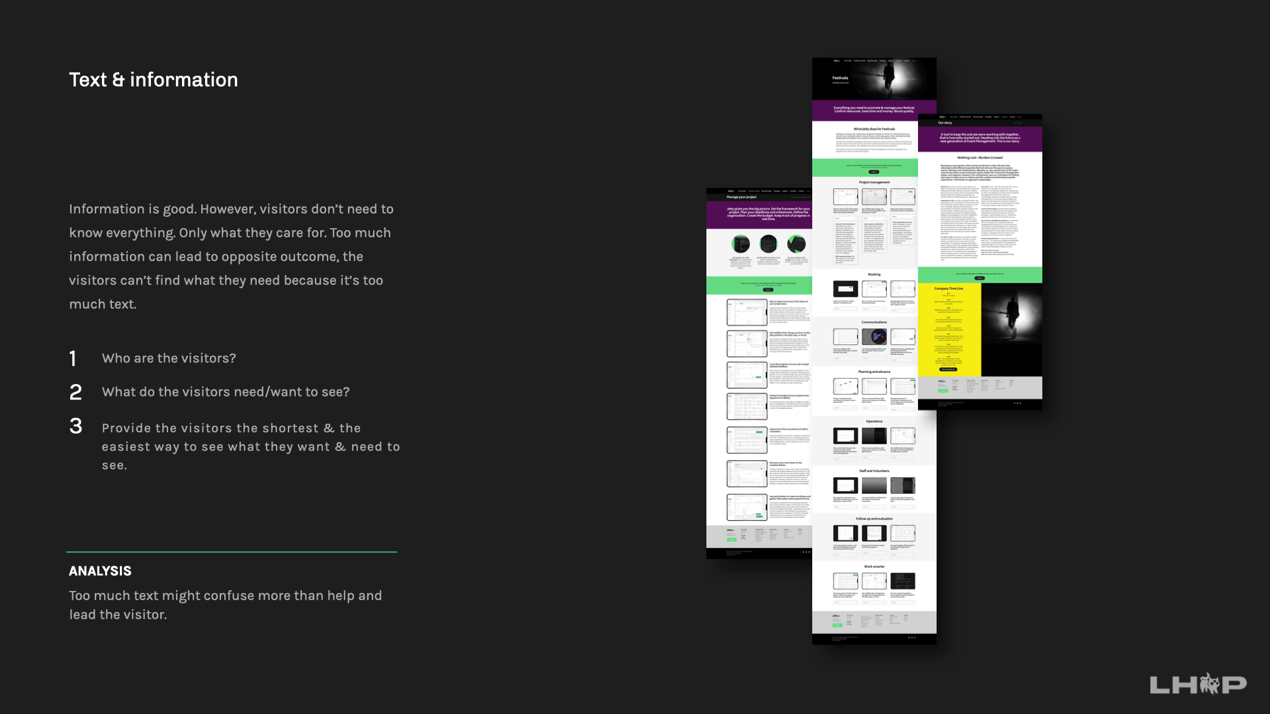
Text & information
Information is good. However, visitors don’t need to know everything. Only what they care for. Too much information can lead to opposite outcome, leading the visitors to not be able to find what they need because of too much text.
- Who are the visitors?
- What do the visitors need/want to see?
- Provide the visitors the shortest & the easiest way to see what they want & need to see.
CTA / Links / Buttons
CTA / Links / Buttons
It is always good to be consistent with buttons and link layouts. The visitor will easily become familiar with the site and will learn more quickly what to expect when clicking on a link or a specific button. Separate regular links with so called, “Call to Action” links (CTA links). If they look the same, they won’t stick out, and the importance of the CTA won’t be as clear.
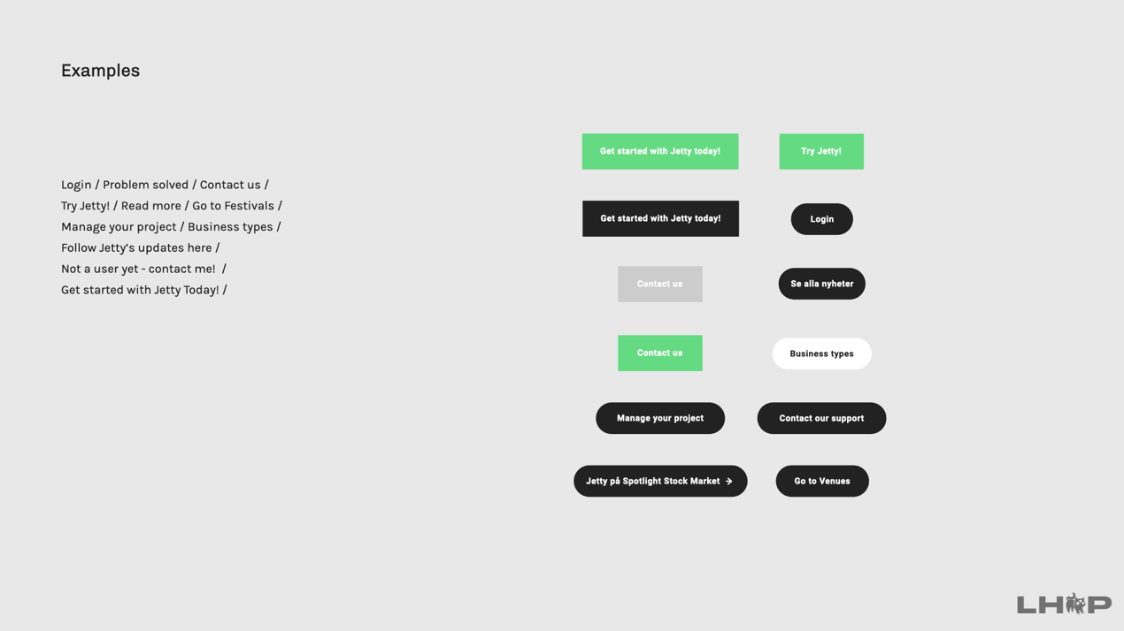
Examples
- Shapes
- Color
- Copy (text button)
- Behavior
- Feedback
- States (default, hover, active etc.)
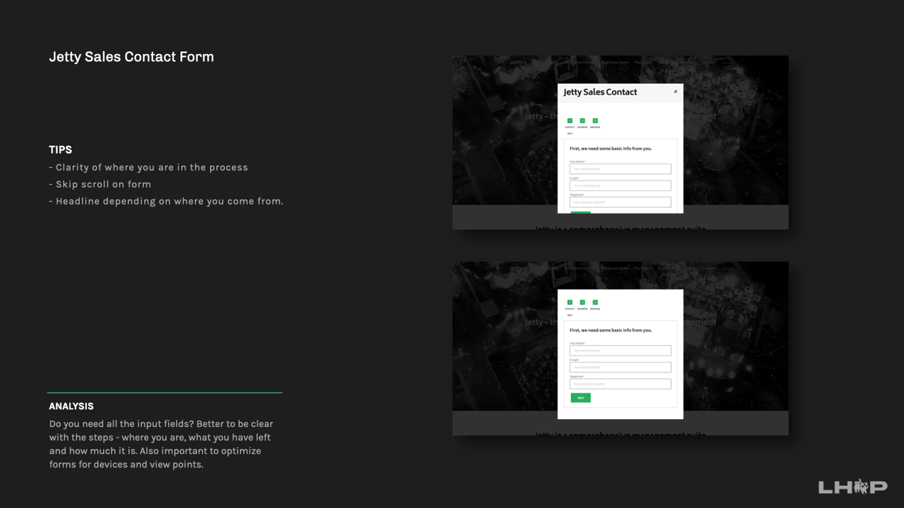
Contact form
Do you need all of the input fields? The shorter the form is, the greater chance for conversion in leads. Better to be clear with the steps - where you are, what you have left and how much it is. The form is not optimized for mobile and therefore it’s hard to see what you’re performing all of the steps.
- Importance of clarity of where you are in the process
- Skip scroll on form
- Headline depending on where you come from.
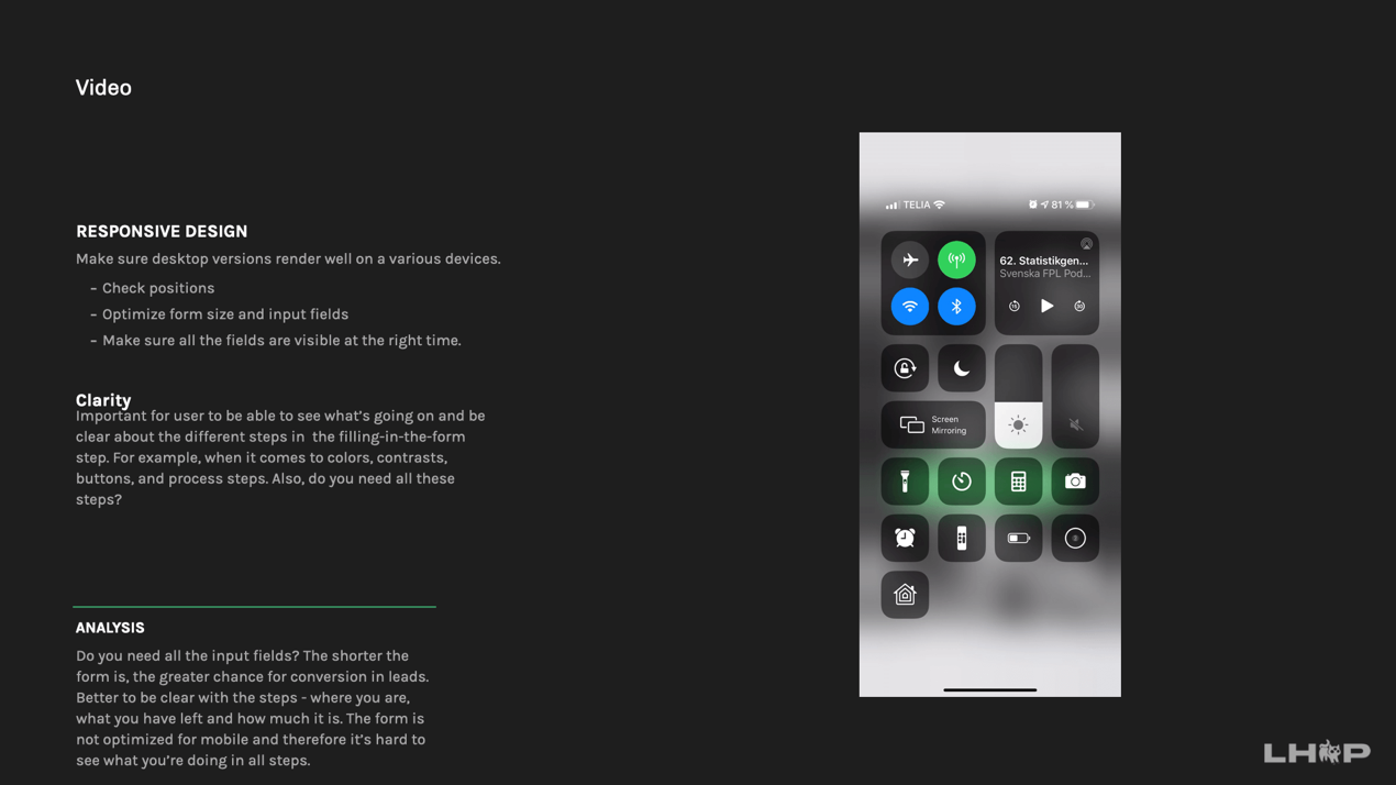
Responsive design
Make sure desktop versions render well on a various devices.
- Check positions
- Optimize form size and input fields
- Make sure all the fields are visible at the right time.
It is important for user to be able to see what’s going on and be clear about the different steps in the filling-in-the-form step. For example, when it comes to colors, contrasts, buttons, and process steps. Also, do you need all these steps?
© 2025 Lina Eriksson